Los Angeles Crime 2010-2015 Visualization
March 6, 2018
As part of the CSUF preparation for 2018 DataFest, we have been exploring the LA Crime dataset from https://data.lacity.org/A-Safe-City/Crime-Data-from-2010-to-Present/y8tr-7khq. The following represents a more coherent version of some exploratory data analysis we did. It provides an example of how simple ggplot2 code can produce visualizations that convey quite a bit of information, so long as you put in the work to format your data the way you want it first.
Reading and Preparing Data
The dataset consists of over 1.6 million crime reports from 2010 until the middle of January 2018. We had to do some extra formatting to get R to recognize the proper date format.
library(readr)
crime <- read_csv("~/DataFest 2018 Prep/Crime_Data_from_2010_to_Present.csv",
                  col_types = cols(`Date Occurred` = col_date(format = "%m/%d/%Y"),
                                   `Date Reported` = col_date(format = "%m/%d/%Y")))
Next, we decided that we should probably hold out the last ~2 years or so of data. This required us to use the dplyr and lubridate packages to get the data set we are actually going to explore, which will be all the reported crimes that occurred in 2010 to 2015.
library(dplyr)
library(lubridate)
crime_to_2015 <- crime %>%
  mutate(Year = year(`Date Occurred`)) %>%
  filter(Year <= 2015)
Our question is simple: What were the most common crimes in Los Angeles over this time period, and when did they tend to occur?
We started by extracting a dataset consisting of only the primary crime code and the description corresponding to that crime code. It’ll make life easier in a second.
crime_descriptions <- crime %>%
  select(`Crime Code`, `Crime Code Description`) %>%
  unique()
We want only one instance of every primary crime code in our descriptions file, so we use the unique() command to remove duplicate rows. It turns out that Crime Code 815 is designated in two slightly different ways in this dataset. If we were interested in that crime code, we’d have to go in and fix this issue.
We then used a smorgasbord of techniques in the dplyr package to get the most common crimes and their descriptions. Granted, there are easier ways to do this, but we also wanted to practice joining two datasets while we were doing this.
crime_types <- crime_to_2015 %>%
  group_by(`Crime Code`) %>% summarize(count = n()) %>%
  arrange(desc(count)) %>% slice(1:12) %>%
  left_join(crime_descriptions, by = "Crime Code")
Let’s look at what the most common crimes are:
print(as.data.frame(crime_types))
##    Crime Code  count
## 1         624 115154
## 2         330  92525
## 3         510  90326
## 4         310  90324
## 5         440  89444
## 6         354  81059
## 7         626  64923
## 8         740  58050
## 9         745  56722
## 10        230  49331
## 11        210  47879
## 12        420  46190
##                                          Crime Code Description
## 1                                      BATTERY - SIMPLE ASSAULT
## 2                                         BURGLARY FROM VEHICLE
## 3                                              VEHICLE - STOLEN
## 4                                                      BURGLARY
## 5                            THEFT PLAIN - PETTY ($950 & UNDER)
## 6                                             THEFT OF IDENTITY
## 7                             INTIMATE PARTNER - SIMPLE ASSAULT
## 8  VANDALISM - FELONY ($400 & OVER, ALL CHURCH VANDALISMS) 0114
## 9                      VANDALISM - MISDEAMEANOR ($399 OR UNDER)
## 10               ASSAULT WITH DEADLY WEAPON, AGGRAVATED ASSAULT
## 11                                                      ROBBERY
## 12              THEFT FROM MOTOR VEHICLE - PETTY ($950 & UNDER)
We’ve got a bunch of different types of assault, thievery, and vandalism. Let’s rename our crimes to be less capitalized, but still more-or-less within the description of the crime:
crime_types <- crime_types %>% mutate(`Crime Name` = c("Battery", "Burglary from Vehicle", "Burglary", "Petty Theft", "Vehicle Theft", "Identity Theft", "Domestic Violence (Simple Assault)", "Misdemeanor Vandalism", "Felony Vandalism", "Assault with Deadly Weapon", "Robbery", "Petty Theft from Vehicle"))
Now let’s figure out when these crimes occur.
crime_times <- crime_to_2015 %>% mutate(hr = as.numeric(`Time Occurred`)%/%100,
                                        Day = wday(`Date Occurred`,
                                                   label = TRUE, abbr = FALSE))
Plotting Data - Quick Exploratory Graphics
We can plot an individual crime (say, battery) over time on each day:
library(ggplot2)
battery <- crime_to_2015 %>% filter(`Crime Code` == 624) %>%
  mutate(hr = as.numeric(`Time Occurred`)%/%100,
         Day = wday(`Date Occurred`,
                    label = TRUE, abbr = FALSE)) %>%
  group_by(Day, hr) %>% summarize(ncrimes = n())

ggplot(battery, aes(x = hr, y = ncrimes, color = Day)) + geom_line() +
  labs(title = "Crimes by Day and Hour - Battery", x = "Hour", y = "Number of Reported Crimes")
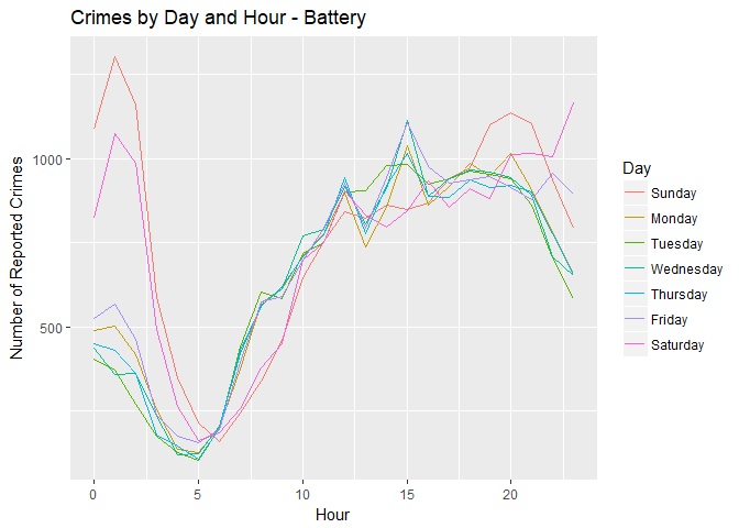
From this graphic, it’s quite clear that during the week, battery tends to peak around 3 PM; on weekends, however, it spikes in the early morning. Let’s compare it to petty theft:
petty_theft <- crime_to_2015 %>% filter(`Crime Code` == 310) %>%
  mutate(hr = as.numeric(`Time Occurred`)%/%100,
         Day = wday(`Date Occurred`,
                    label = TRUE, abbr = FALSE)) %>%
  group_by(Day, hr) %>% summarize(ncrimes = n())

ggplot(petty_theft, aes(x = hr, y = ncrimes, color = Day)) + geom_line() +
  labs(title = "Crimes by Day and Hour - Petty Theft", x = "Hour", y = "Number of Reported Crimes")
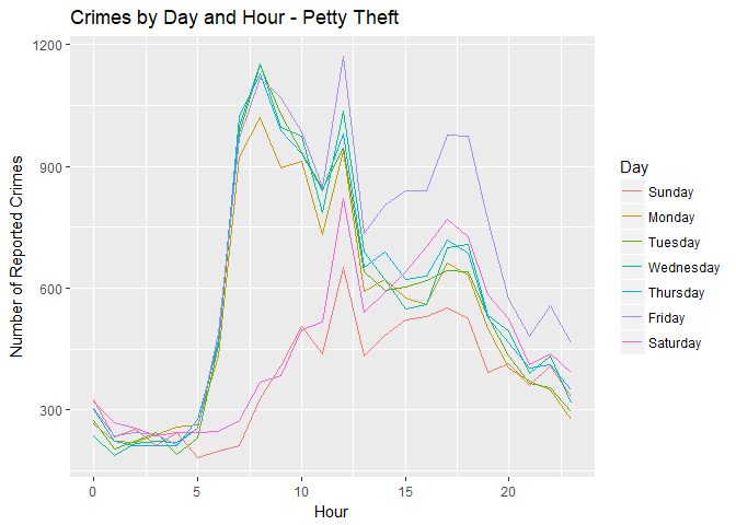
There’s a completely different pattern. Petty theft seems to spike on weekday mornings, and then again on Friday around 5:00-6:00 PM. For whatever reason, petty theft is consistently lowest on Sunday compared to any other day.
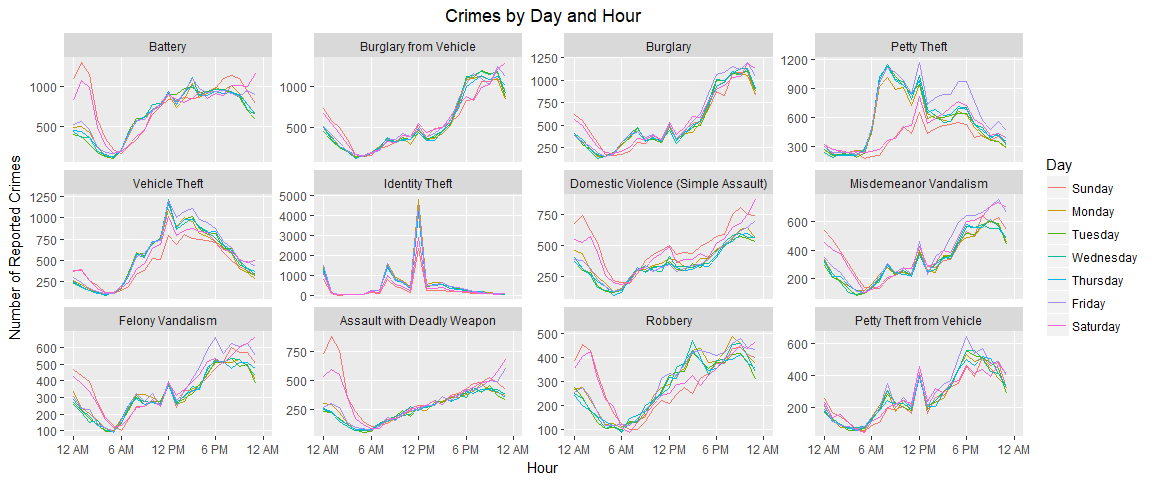
Plotting Data - Nice Graphics
With a lot more work we can make this look a lot nicer (although it’s not necessary to do so for exploratory purposes):
times <- c(paste(c(12, 6), rep(c("AM","PM"), each = 2)), "12 AM")
crime_names <- crime_types$`Crime Name`
names(crime_names) <- crime_types$`Crime Code`

crime_by_hour <- crime_times %>% filter(`Crime Code` %in% crime_types$`Crime Code`) %>%
  group_by(Day, hr, `Crime Code`) %>% summarize(ncrimes = n())
crime_plot <- crime_by_hour %>% ggplot(aes(x = hr, y = ncrimes, color = Day)) +
  geom_line() +
  facet_wrap(~factor(`Crime Code`, levels = crime_types$`Crime Code`),
             scales = "free_y", labeller = labeller(.cols = crime_names))
crime_plot + labs(title = "Crimes by Day and Hour",
                  x = "Hour", y = "Number of Reported Crimes") +
  scale_x_continuous(breaks = seq(0,24, by = 6),
                     labels = times, limits = c(0,24)) +
  theme(panel.grid.minor = element_blank(), plot.title = element_text(hjust = 0.5))
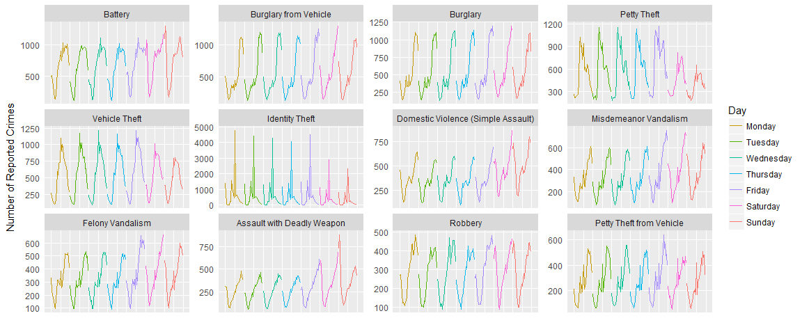
With some more work we can break apart those lines to observe the pattern over the entire week:
crime_reordered <- crime_by_hour %>% mutate(Day2 = factor(Day, levels = levels(Day)[c(2:7,1)]))
crime_plot2 <- crime_reordered %>% ggplot(aes(x = hr + 24*(as.numeric(Day2)-1), y = ncrimes, color = Day)) +
  geom_line() +
  facet_wrap(~factor(`Crime Code`, levels = crime_types$`Crime Code`),
             scales = "free_y", labeller = labeller(.cols = crime_names))
crime_plot2 + labs(x = "", y = "Number of Reported Crimes") +
  scale_x_continuous(breaks = seq(0,168, by = 12), labels = NULL, limits = c(0,168)) +
  scale_color_discrete(breaks = levels(crime_reordered$Day2)) +
  theme(panel.grid.minor = element_blank(), plot.title = element_text(hjust = 0.5),
        axis.ticks = element_blank())